New ‘Welcome to Wandsworth’ sign (at the date of publishing, they had not done around Battersea yet) - Credit: Council press release
A modern W set against a variety of background colours is the new logo for the borough of Wandsworth.
After 44 years in opposition, Labour gained overall control of Wandsworth Council in the May 2022 local elections. The Labour administration would argue that much has changed in the last two and a half years, following decades of Conservative leadership. A key focus has been the provision of social housing, alongside reorganising and improving refuse collection, including the introduction of food waste collection.
With the publicity surrounding the 12 month event, it was an ideal moment to introduce a new branding. The Council’s decision paper said:
“As creating a lasting legacy is a key outcome for Borough of Culture and as Wandsworth is changing, it was identified as a key moment in time to review and refresh the Council’s brand in a way that continues to reinforce the positivity and modernity of the LBOC identity.”
“The challenge was to create a brand identity that would truly mirror their vibrant and diverse community while nurturing unity and pride across all neighbourhoods.
Through sharp, disruptive design elements, we incorporated unexpected blips and patterns that create a sense of excitement and momentum. The selection of a striking, geometric typeface perfectly complemented this energetic design, embodying the personality and power that defines Wandsworth.”
The simplistic and versatile design, with a choice of colourful backgrounds, allows for adaptable layouts based on usage. There is a suite of four brand colours that are being used.
Wandsworth
Battersea
Clapham Junction
Earsfield
Putney
Furzedown
As it’s often the case for many changes, early reactions have been mixed. Many praise the design, noting how the shape of the borough subtly echoes the stylised “W” in the logo.
Shape of the borough
Others are less enthusiastic. On Reddit forum, one user commented:
“I’m very slow to shit on anyone’s hard work and I’m wary that the people hiring the designer play a HUGE role in the outcome but this, presented as is, is bad”
“This new logo doesn’t tell much. It’s cold. But it’s more practical than the old one,” remarked Paule Gauer, who is a professional web designer and has made countless logos. The flat design (strictly two-dimensional) is still prevalent on the Internet as logos and websites focus on clean, uncluttered layouts.
The shift towards flat design (strictly two-dimensional) remains a strong trend online, as logos and websites increasingly favour clean, uncluttered layouts. However, branding is evolving into “Flat 2.0,” incorporating depth, gradients, and motion to enhance adaptability, minimalism, and interactivity in digital spaces.
Reflections of the logo on the Town Hall facade – Credit: David Curran
The cost of producing the new brand, including design costs, was £13,824. A website Welcome to Wandsworth has been linked to this new logo as a platform to host the London Borough of Culture events.
The Council told us that key signage is being updated, and other replacements will happen incrementally as part of regular maintenance and renewals. “This ensures cost efficiency and careful consideration of budgetary constraints,” they said.
The Wandsworth logo and website design through recent history
Wandsworth borough sign on Lavender Hill – Credit: David Curran
For over two decades, Wandsworth Council’s identity was shaped by the blue and green logo featuring the slogan “The Brighter Borough“, introduced in 2000. This design highlighted key landmarks, including Battersea Power Station, one of the borough’s most recognisable structures. The choice of blue and green reflected Wandsworth’s connection to the River Thames and its numerous parks.
Fellowstudio has a great page commenting on the 32 boroughs in London. Each of them have their own unique identity, represented by a logo or emblem. Some of the comments are very descritpive such as “Featuring 4 intertwined circles and with a sans-serif typeface below” when describing the Bent’s logo, or “one of the best in the list at portraying authority and history. It uses their original crest and a thin serif font in all caps“, about Hillingdon and “The royal blue gives the impression of wealth and associates with royalty” for Kensington & Chelsea. Others could make you smile, such as “This logo is simple and direct, but does look a little bit like the recycling logo” when talking about Camden, or “The tree likely is to reflect the Ealing Common or Walpole Park…or their love of broccoli“, for Ealing.
Wandsworth Borough logo 2003-2024
They will now have to update the Wandsworth Logo as they referred to the old one chosen by the Conservatives. The old brand’s description says:
“[It] features some of its key landmarks in a skyline design. It uses a lot of dark blue and green writing to outline its slogan and name in a serif font. The design nicely outlines Battersea power station which is one of the most recognisable buildings in South West London.”
It was introduced with the trademark “100 years of service” and fireworks on a blue background.
Wandsworth borough Logo 2000
This is only in April 2003 that the logo with fireworks and celebrating 100 years was replace by the one that we have been familiar with for the last 21 years. At the same time, the new slogan is revealed: “The Brighter Borough“.
1996
2000
2003
2006
2009
2012
2014
2019
2023
In summer 2019, while keeping the same logo, they decided to modernise completely the website with a flat design and plain colours (although some parts of the website, especially the most important planning service have never been updated)
Website in Jan 2025
Website in Feb 2025
The logo was also mocked in the more recent years, as some local resident objecting to the massive property development authorised under the Tory administration, commented that the iconic tower station featured on the logo was no visible now as it was surrounded with the massive Nine Elms developments.
The old logo was occasionally mocked in recent years, with critics arguing that Battersea Power Station, once a prominent feature, was now obscured by the Nine Elms developments authorised by the Conservatives Council.
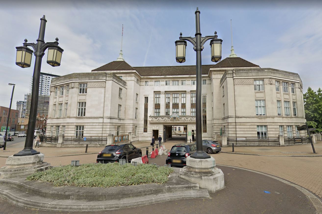
Controversial banners application on the Town Hall
As part of the Borough of Culture celebrations, the Council also submitted a very controversial application for large banners to advertise for the event to the front facade of the listed Town Hall buildings in Wandsworth Town (planning application 2024/4469).
“An incompetent application. It leaves so many questions unanswered. It involves permanent damage to a listed building. Leave aside the design of the banner, we are looking at the possibility of banners in perpetuity on the building. We have no alternative other than to object”.
Following the backlash, the application has now been withdrawn.
Banners advertising for the Borough of Culture 2025 – Credit: Application 2024/4469 illustration
Wandsworth’s Council’s 7 rings, 7 day guarantee
The rebranding gave also to the Council the opportunity to launch a communication offensive to present themselves as a listening council.
Their initiative, called “7 rings, 7 day guarantee“, launched on January 30, 2025, aims to enhance resident engagement and expedite street maintenance across the borough. I came as a response to the complaint of many residents telling them their frustration when they can’t get through to the Council to report their issue.
They pledge to repair graffiti, damaged street signs, or dangerous potholes within seven days of being reported. According to the Council, this commitment reflects their dedication to creating and maintaining high-quality public spaces, ensuring residents can take pride in their neighbourhoods.
Key Features:
Prompt Communication: Residents can contact the council via the dedicated phone line at 020 8871 6000, where calls are answered within seven rings. Alternatively, emails can be sent to hello@wandsworth.gov.uk.
Swift Repairs: Upon reporting issues such as graffiti, broken street signs, or dangerous potholes, the council commits to addressing and fixing these problems within seven days.
Additionally, the council now offers each household two free bulky waste collections per year. This idea was originally proposed by the community group CJAG during the 2022 local election as their idea was to mimic the service provided by the City of London on hazardous items (2 free collections per year). It complements the council’s commitment to providing weekly waste and recycling collections and expanding Mega Skip Days.
Do you think what we are doing is helping the community and you want to encourage us to do more?
Your help means we can spend more time researching stories, talking to contacts, sitting through meetings and writing stories. Any money given will support community and public interest news and the expansion of our coverage in area of Clapham Junction. Battersea, Wandsworth and around.
Support us, help us to expand: subscribe to CJI with a monthly donation
CJI editor and Clapham Junction Action Group co-founder and coordinator since 2008, Cyril has lived in Clapham Junction since 2001.
He is also the founder and CEO of Habilis-Digital Ltd, a digital agency creating and managing websites and internet solutions.
We use cookies on our website to give you the most relevant experience by remembering your preferences and repeat visits. By clicking “Accept All”, you consent to the use of ALL the cookies. However, you may visit "Cookie Settings" to provide a controlled consent.
This website uses cookies to improve your experience while you navigate through the website. Out of these, the cookies that are categorized as necessary are stored on your browser as they are essential for the working of basic functionalities of the website. We also use third-party cookies that help us analyze and understand how you use this website. These cookies will be stored in your browser only with your consent. You also have the option to opt-out of these cookies. But opting out of some of these cookies may affect your browsing experience.
Necessary cookies are absolutely essential for the website to function properly. These cookies ensure basic functionalities and security features of the website, anonymously.
Cookie
Duration
Description
_GRECAPTCHA
5 months 27 days
This cookie is set by the Google recaptcha service to identify bots to protect the website against malicious spam attacks.
ARRAffinity
session
ARRAffinity cookie is set by Azure app service, and allows the service to choose the right instance established by a user to deliver subsequent requests made by that user.
ARRAffinitySameSite
session
This cookie is set by Windows Azure cloud, and is used for load balancing to make sure the visitor page requests are routed to the same server in any browsing session.
cookielawinfo-checkbox-advertisement
1 year
Set by the GDPR Cookie Consent plugin, this cookie is used to record the user consent for the cookies in the "Advertisement" category .
cookielawinfo-checkbox-analytics
11 months
This cookie is set by GDPR Cookie Consent plugin. The cookie is used to store the user consent for the cookies in the category "Analytics".
cookielawinfo-checkbox-functional
11 months
The cookie is set by GDPR cookie consent to record the user consent for the cookies in the category "Functional".
cookielawinfo-checkbox-necessary
11 months
This cookie is set by GDPR Cookie Consent plugin. The cookies is used to store the user consent for the cookies in the category "Necessary".
cookielawinfo-checkbox-others
11 months
This cookie is set by GDPR Cookie Consent plugin. The cookie is used to store the user consent for the cookies in the category "Other.
cookielawinfo-checkbox-performance
11 months
This cookie is set by GDPR Cookie Consent plugin. The cookie is used to store the user consent for the cookies in the category "Performance".
CookieLawInfoConsent
1 year
Records the default button state of the corresponding category & the status of CCPA. It works only in coordination with the primary cookie.
ts
3 years
PayPal sets this cookie to enable secure transactions through PayPal.
ts_c
3 years
PayPal sets this cookie to make safe payments through PayPal.
viewed_cookie_policy
11 months
The cookie is set by the GDPR Cookie Consent plugin and is used to store whether or not user has consented to the use of cookies. It does not store any personal data.
Analytical cookies are used to understand how visitors interact with the website. These cookies help provide information on metrics the number of visitors, bounce rate, traffic source, etc.
Cookie
Duration
Description
_ga
2 years
The _ga cookie, installed by Google Analytics, calculates visitor, session and campaign data and also keeps track of site usage for the site's analytics report. The cookie stores information anonymously and assigns a randomly generated number to recognize unique visitors.
_ga_GV82CDZWTQ
2 years
This cookie is installed by Google Analytics.
CONSENT
2 years
YouTube sets this cookie via embedded youtube-videos and registers anonymous statistical data.
Advertisement cookies are used to provide visitors with relevant ads and marketing campaigns. These cookies track visitors across websites and collect information to provide customized ads.
Cookie
Duration
Description
VISITOR_INFO1_LIVE
5 months 27 days
A cookie set by YouTube to measure bandwidth that determines whether the user gets the new or old player interface.
YSC
session
YSC cookie is set by Youtube and is used to track the views of embedded videos on Youtube pages.
yt-remote-connected-devices
never
YouTube sets this cookie to store the video preferences of the user using embedded YouTube video.
yt-remote-device-id
never
YouTube sets this cookie to store the video preferences of the user using embedded YouTube video.
yt.innertube::nextId
never
This cookie, set by YouTube, registers a unique ID to store data on what videos from YouTube the user has seen.
yt.innertube::requests
never
This cookie, set by YouTube, registers a unique ID to store data on what videos from YouTube the user has seen.
Other uncategorized cookies are those that are being analyzed and have not been classified into a category as yet.
Cookie
Duration
Description
pvc_visits[0]
1 day
This cookie is created by post-views-counter. This cookie is used to count the number of visits to a post. It also helps in preventing repeat views of a post by a visitor.
Support our reporting with a contribution of any size
Your support help us spending more time on reporting local news and producing quality content.
Every contribution, however big or small, is so valuable for our future.
100% independent media, open access, without advertising, financed by its donors only