
Author: Cyril Richert
 It seems to be the norm with developers: when you want to submit a controversial proposal including tall buildings and high density for developments, you just trick the pictures to mislead the public.
And if you think that Peabody Trust is safe on such practices, think again.
For example, we take the photo provided by Peabody for the leaflet distributed by the Council:

I have tried to get the same view with the current layout. In order to do it I simply used Google Earth. But it is not as simple actually… In order to get the bridge and the tree on the right hand side on the same line, see what view I needed to apply to the photo:

You can see the distortion made by Peabody using the wide angle: images are not showing an accurate representation of what would be seen by the human eye.
Wide-angle lenses have a profound impact on perspective: they make objects seem smaller, with the result that you move closer to fill the frame. The act of doing this exaggerates the difference in size in between nearby objects and those farther away.
Actually if you want to see the impact of the development as provided by Peabody, you need a bit of digging through hundred documents about Peabody’s proposal on the Council’s website.
The document we are looking for is called Landscape Visual Impact Assessment: Information Supplement. In the methodology it states clearly (page 6):
For local views a wide angle lens of 24mm or 35mm was used in order to capture as much of the proposal and its surroundings as possible.
Using Peabody’s representation allows them to diminish the impact of the developments, as the taller buildings will appear lower than they will be seen in reality!
In the document, we found the image used to create the visual presentation shown above:

Having managed to match the size on both images (by matching the lower part of the picture with the bridge and the tree) it is easier then to show the impact of the development by comparing existing estate vs proposed by just super-imposing the new buildings of the first image on the previous photo:
 +
+ 

=

In the same Landscape Visual Impact document you have a comparison of 2 similar views. Guess where is the trick here?
 +
+ 


Yes, you got it, they cut the tallest building so it diminishes the real impact! No worries, we put it back:

See here the size of the new scheme in comparison with the current estate:

Accurate representation vs misleading images: deja vu
Two years ago, the same controversy was shown for the Ram Brewery proposal and the Wandsworth Society demonstrated with success that the images provided by the developers were misleading.
Following the inquiry, the government inspector rejected the plan and wrote in his report (p7):
“Guidance on how to prepare AVRs consistently indicates that images should ideally be made within a 40° field of view (FOV); beyond that, the perceived shapes of surrounding buildings may be distorted […] the use of a wide angle lens has the effect of distorting perspective and distance, and thus the spatial relationship between foreground and background. Existing buildings, and therefore the new ones, appear further away or smaller than they are or would be in reality, This was particularly apparent to me when I compared the AVRs to the actual views from the same viewpoints and is also demonstrated in the Wandsworth Society’s comparable 40º AVRs.
[…] the applicant’s AVRs cannot be taken as accurately representing what would be seen by the human eye.“
In 2009, along with the Wandsworth Society, the Putney Society and the Battersea Society we submitted a joint statement on tall buildings where we specifically said:
“Appropriate publicity should be agreed with Council Members and officials at the pre-application stage and should use images which demonstrably reflect the true appearance, height and mass of the development measurable against neighbouring buildings.”
Have the Wandsworth Council’s planning officers taken any notice? SEE UPDATE at the bottom of the article.
More comparisons
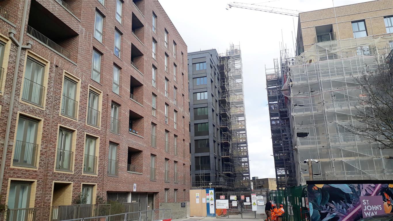
Without being able to rely on Peabody’s images to get a true visual representation on the potential impact of their proposal on the community, I used existing pictures of the estate and superimposed what I think will be the impact of the new scheme. See the result below.
NB: Each montage (provided to give an idea of the potential impact, not 100% accurate) follows the current view. Click on the thumbnails to see bigger.
 >>>
>>> 
 >>>
>>> 
 >>>
>>> 
UPDATE 21/06/2012:
The Wandsworth Society told me that the planners did add to their policies after the Ram site findings. The Development Management Policies Document now states, para 2.49 page 23:
“Detailed visual assessments submitted with applications in order to demonstrate compliance with this policy (I think this means DMS1 but it could mean the tall buildings section of S2UDS) will be required to accurately represent what would be seen by the human eye. The use of wide-angle lenses, for example, can distort perspective and distance, and thus the relationship between the foreground and background, and this will not be acceptable”.
So we must point this out to the council planners and the PA Committee.


outstanding photographic analysis and it really shows just how overpowering this development will be for us residents…it also shows just how ugly and soviet-style the designerss have been there isn’t a tree to be seen, thank god I’m on the southside as people on the northside won’t see the sun from december to march they will be in forever in the shadows…it also show just how claustrophobic ST. John’s Hill could become should the council say yes. Should be interesting to see the model next week. james
I used to be really for this development but having seem these images i’m not not so sure. I think its correct to assume also that the highest block of the peabody will essentially set presidence for the Station itslelf once that’s developed.
not good 🙁
Phenomenal footwork, Cyril-a thousand thanks for all this work.
Well done, very shocking. You really wonder if the decision-makers can have the best interests of their residents at heart if they can´t see how appalling this would be.
well i’ve looked closely at this and it seems to me that the modified images are about as misleading as the original ones. The photos over the bridge seem to put the new development on the railway line!!
Lets stick to the actual plans rather than crude manipulation by either party.
andy healey> Which images are you talking about? We expect developers to provide appropriate representation, using their own technology.
Without judging on our images, do you think it is appropriate for developers to breach Council’s policy without notice?
As you see on their image (the animated image cutting the top of one building is actually THEIR image) it shows that the buildings are actually really on the hedge of the railway (they want to maximise the potential of the site)!
Our images are just here to give you an idea of the impact and do not claim to be 100% accurate (unlike the one displayed by Peabody).