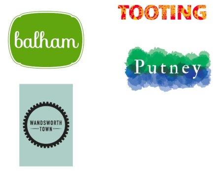
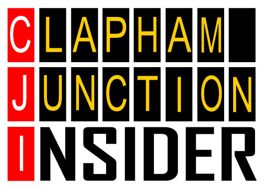
Logos for the different town centres in Wandsworth have been designed by the Mosaic Partnership.
This is part of the Visioning exercise that has been commissioned by Wandsworth Council (with a government grant of £100,000 in hands).
- Read our article: Visioning for the future of Clapham Junction
The previous suggested logo was criticised for looking like a fashion brand with a snow-flake effect (the rail crossing).
Now Mosaic is asking to vote on different proposals here: https://www.surveymonkey.com/s/9JC9GK5
(make up your mind quickly, vote is finishing today!)
On Tuesday, I suggested a series of logos (see all here) such as:


Unfortunately there is no comment box in the survey It really is a shame that despite my different proposal sent ahead of the final result, well on time for Mosaic to review, none of them were included in the choice. Even the colour (yellow) although criticized during our Monday meeting, was not changed to orange as I suggested.
For your information, logos of the other town centres are below.


These logos are appalling … graphically they are amateur at best.
Clapham Junction does not deserve this.
The last batch were a little better.
The people designing this logo probably don;t even know where clapham junction is.
Put the logos up in public and ask people if they like it or not and don’t ask which they would chose.
Hmmm knowing that the chosen option is https://www.surveymonkey.com/s/9JC9GK5 , I wouldn’t say they are “amateur” and “appalling”.